
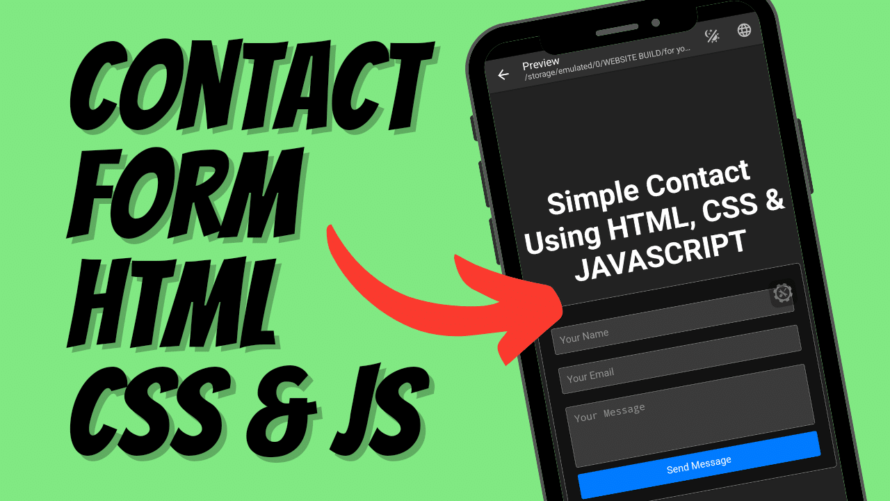
Creating a contact form is a fundamental skill for web developers. It’s one of the primary ways users can communicate with you or your business online. In this tutorial, we’ll walk through the process of creating a simple yet effective contact form using HTML, CSS, and JavaScript.
Watch video tutorial:
HTML: The Structure
Our journey begins with HTML, the skeleton of our contact form. The provided index.html file sets up a basic structure with a DOCTYPE declaration and language attribute to ensure proper rendering and accessibility. The meta tags are crucial for responsiveness and compatibility across different devices and browsers.
The form itself, wrapped in a <div> with a class of “container,” contains input fields for the user’s name, email, and a textarea for their message. Each field is marked as required, making sure the user doesn’t leave any essential information out.
INDEX.HTML:
<!DOCTYPE html>
<html lang="en">
<head>
  <meta charset="UTF-8">
  <meta name="viewport" content="width=device-width, initial-scale=1.0">
  <title>Simple Contact Form Using HTML, CSS, JAVASCRIPT</title>
  <link rel="stylesheet" href="styles.css">
</head>
<body>
	<div class="title-section"><h1>Simple Contact Using HTML, CSS & JAVASCRIPT</h1></div>
	<div class="container">
	<form id="contactForm">
		<input type="text" id="name" name="name" placeholder="Your Name" required>
	<input type="email" id="email" name="email" placeholder="Your Email" required>
		<textarea id="message" name="message" placeholder="Your Message" rows="4" required></textarea>
	<input type="submit" value="Send Message">
	</form>
	</div>
	<script src="script.js"></script>
</body>
</html>
CSS: Adding Style
While the HTML provides the structure, CSS gives life to our form, making it visually appealing. The styles.css file is linked within the <head> section, ensuring that when the page loads, it looks great.
The universal selector * is used to reset default margins and paddings, ensuring consistency across all elements. The body selector sets the stage with a clean, light background and centers the content using flexbox. The .title-section class adds a touch of elegance to the form’s title, with centered text and a comfortable margin.
The .container class wraps our form, giving it a defined width, padding for spacing, and subtle styling with a border and box-shadow to create a sense of depth. Input fields and the textarea are styled uniformly with the same width, padding, and border to maintain a cohesive look. The submit button is styled to stand out with a bright blue background, white text, and a change in color on hover to indicate interactivity.
STYLE.CSS:
* {
	margin: 0;
	padding: 0;
	box-sizing: border-box;
}

body {
	font-family: Arial, sans-serif;
	background-color: #f4f4f4;
	margin: 0;
	padding: 0;
	display: flex;
	flex-direction: column;
	justify-content: center;
	align-items: center;
	height: 100vh;
}

.title-section {
	text-align: center;
	margin-bottom: 20px;
	font-size: 20px;
}

.container {
	width: 100%;
	max-width: 400px;
	padding: 20px;
	border: 1px solid #ccc;
	border-radius: 5px;
	box-shadow: 0 4px 8px rgba(0,0,0,0.1);
	background-color: #fff;
}

input[type="text"],
input[type="email"],
textarea {
   width: 100%;
   padding: 10px;
   margin: 10px 0;
   border: 1px solid #ccc;
   border-radius: 3px;
}

input[type="submit"] {
	width: 100%;
	padding: 10px;
	border: none;
	background-color: #007bff;
	color: white;
	cursor: pointer;
	border-radius: 3px;
}

input[type="submit"]:hover {
	background-color: #0056b3
}
JavaScript: Bringing Functionality
The script.js file is responsible for adding interactivity to our form. It listens for the submit event on our form and takes over the default submission process with event.preventDefault(). This is a common technique used to validate and process form data before sending it to a server.
The script captures the user’s name, email, and message from the form fields and uses an alert to provide immediate feedback. This simple interaction reassures the user that their information has been received.
SCRIPT.JS:
document.getElementById('contactForm').addEventListener('submit', function(event) {
	event.preventDefault();
	var name =
document.getElementById('name').value;
    var email = document.getElementById('email').value;
    var message = document.getElementById('message').value;
    alert('Thank you, ' + name + '. We have received your message:\n' + message + '\nWe will contact you at' + email +'.');
});
Best Practices
The tutorial emphasizes the importance of replacing the alert function with a proper backend service call in a real-world application. This is a best practice for processing form data securely and efficiently.
Conclusion
This guide provides a solid foundation for anyone looking to implement a contact form on their website. It covers the necessary HTML elements, styling with CSS for a polished look, and basic JavaScript for user interaction. The final product is a simple, stylish, and functional contact form suitable for any website.


