Let’s be brutally honest.
Your website is a leaky bucket.
You spend a fortune of time and money trying to fill it up. You pour in traffic from SEO, from Facebook ads, from social media, from every channel you can think of. But no matter how much traffic you pour in, the bucket never seems to get full.
Why? Because it’s riddled with holes.
Every visitor who lands on your site and leaves without giving you their email address is a leak. It’s a lost lead. A lost future customer. A lost sale. You’re spending a fortune to attract visitors, only to let 98% of them slip through your fingers and disappear forever.
Your business isn’t failing because of a traffic problem. It’s failing because of a conversion problem.
Plugging those leaks—turning more of your existing visitors into email subscribers—is the single highest-leverage activity you can do for your business right now. Doubling your conversion rate is the same as doubling your traffic, but it’s infinitely cheaper and faster.
So how do you do it? It’s not about magic tricks. It’s about science.
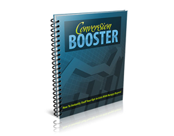
I just read a lean, mean, 17-page guide called “Conversion Booster,” and it’s a pure, tactical masterclass in the science of getting the opt-in. It’s a toolkit for plugging the holes in your bucket, one by one.
Let’s dive into the core, profit-boosting systems it lays out.
The Conversion Real Estate: You Need More Than One “For Sale” Sign
Imagine you owned a retail store, but you only had one tiny, hidden sign in the back corner that said, “Hey, we sell stuff.” It sounds ridiculous, right?
Yet, that’s exactly what most people do on their websites. They have one little opt-in form tucked away in the sidebar or the footer and wonder why their email list isn’t growing.
You need to treat every part of your website as valuable real estate for conversion. The guide breaks down the different types of “For Sale” signs you can use.
H3: The Polite Handshake: The Sidebar & In-Post Form
This is your baseline. It’s the expected, non-intrusive opt-in form that sits in your sidebar or at the end of a blog post. It’s important to have, but let’s be clear: its conversion rate is typically terrible. It’s a passive tool. It only converts people who are already actively looking for it.
The Unignorable Pattern Interrupt: The Pop-Over & Lightbox
I know what you’re thinking. “But I hate pop-ups!”
I get it. But here’s the uncomfortable truth: they work. They work incredibly well. Why? Because they are a “pattern interrupt.” They break the user out of their passive scrolling and force them to make a conscious decision: “Yes, I want this,” or “No, I don’t.”
The key to using them effectively is to be smart, not sleazy. Use exit-intent technology, which only triggers the pop-up when a user is about to leave your site. This way, you’re not interrupting their reading experience; you’re making one last, compelling offer before they go.
The “All or Nothing” Play: The Feature Box & Opt-in Bar
A “feature box” is a prominent opt-in form that sits right below your header and above your main content. An “opt-in bar” is a thin bar that sticks to the top or bottom of the screen.
These are powerful because they are always visible without being as intrusive as a pop-up. They are a persistent, gentle reminder of the value you’re offering. They are one of the easiest ways to instantly boost your site-wide conversion rate.
The Conversion Machine: Deconstructing Your Squeeze Page
Your website has many jobs. But a squeeze page has only one: to convert. It’s a dedicated, distraction-free landing page designed for the sole purpose of capturing an email address. The guide dissects the different types.
Short vs. Long: How Much “Sizzle” Do You Need?
- Short Squeeze Pages are best for simple, low-commitment offers (like a checklist or a cheat sheet) when the traffic is already “warm” and trusts you. It’s a quick, direct pitch: “Here’s the awesome thing, give me your email to get it.”
- Long Squeeze Pages are necessary for more complex offers (like a multi-day email course or a webinar) or when the traffic is “cold” and doesn’t know you yet. You need more space (more copy, more bullet points, more testimonials) to build value, overcome objections, and earn their trust.
The Ultimate Trust-Builder: The Video Squeeze Page
Want to skyrocket your conversion rate? Put a face to the name. Replace your static text with a short, 2-3 minute video.
In that video, you can look your visitor in the eye and personally explain the benefits of your free offer. You can convey enthusiasm, empathy, and expertise in a way that text never can. Video builds a human connection, and that connection is the ultimate conversion booster.
The Golden Rule: You Are Never “Done”
This is the final, most important lesson from the guide. The pros understand that conversion optimization is not a one-time event; it’s a continuous process of testing and tweaking.
You don’t guess what works. You let your audience tell you with their clicks.
- You test Headline A vs. Headline B.
- You test a red button vs. a green button.
- You test a video vs. a text page.
A small, 1% improvement in your conversion rate might not sound like much, but compounded over time, it’s the difference between a struggling hobby and a thriving, profitable business.
“Conversion Booster” is your tactical manual for this process. It’s the science of turning clicks into customers, simplified into a 17-page blueprint.
Stop letting your traffic leak away. It’s time to plug the holes in your bucket.
And to give you the tools you need, I’m giving you the entire guide. You can download “Conversion Booster” for free.
Stop wasting traffic. Start building your most valuable asset today.